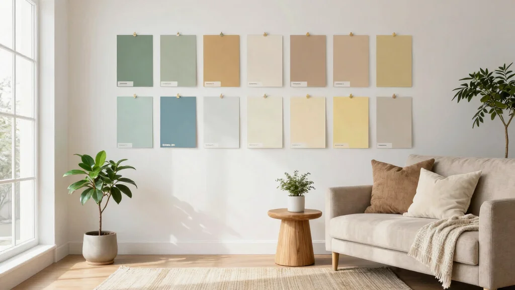
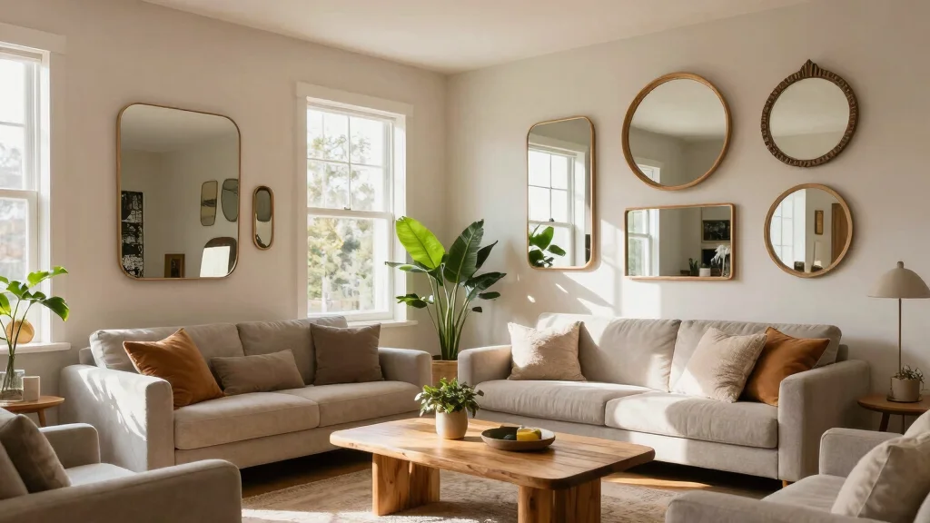
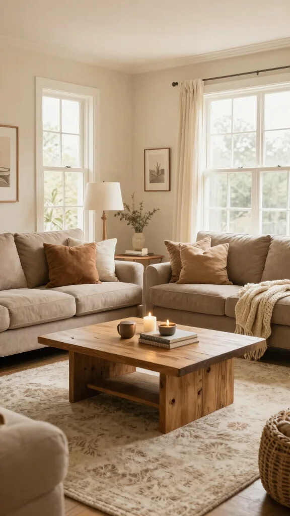
Creating a cozy and inviting living room is a dream for many. As the heart of the home, this space deserves a splash of personality and warmth. With the right living room paint colors, you can transform your area into an oasis that reflects your style. In this post, I’ve gathered a list of 15 paint hues that interior designers often choose. Why? Because they know how vital color is in setting the mood and enhancing your home environment.
If you’re someone who loves home decor and is looking for fresh ideas, this one’s for you. Whether you’re preparing for a full living room makeover or just want to refresh the walls, these colors can breathe new life into your space. From serene greens to bold yellows, these options cater to various tastes and preferences. You’ll also get insights into color psychology, helping you understand how each shade can influence the atmosphere in your living room.
Get ready to explore paint color palettes that combine style and comfort. By the end of this post, you’ll have a clearer idea of which colors resonate with you and how they can elevate your home decoration ideas. Let’s dive into the colors that can truly make your living room feel like home.
Key Takeaways
– Discover 15 living room paint hues that interior designers favor for their versatility and charm.
– Explore how color psychology influences mood and ambiance, helping you choose the right hue for your space.
– Learn about eco-friendly paint options that meet sustainability standards without compromising on style.
– Gain insights into current interior design trends that highlight the importance of color in home decor.
– Find practical tips for choosing the perfect paint color that complements your furniture and accessories.
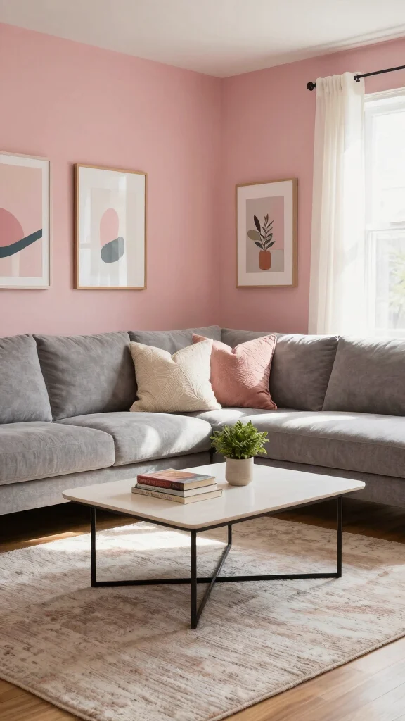
1. Soft Sage Green
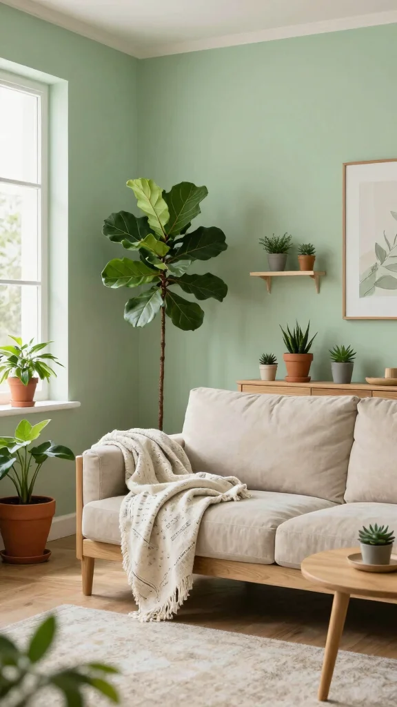
Soft Sage Green invites a sense of tranquility into your living room, creating a peaceful retreat that feels effortlessly harmonious. This muted green shade beautifully complements natural materials, like wood and stone, making it a perfect choice for eco-conscious decor. Pair it with indoor plants and light wood furniture to enhance its calming effect and establish a serene atmosphere throughout the space.
To maximize the appeal of Soft Sage Green, consider painting all four walls or choosing an accent wall behind your favorite seating area. Earthy-toned accessories, like terracotta pots or woven baskets, can further enhance the natural vibe, creating a cohesive look.
Here are some ways to incorporate Soft Sage Green:
– Pair with creamy whites and soft browns for a balanced aesthetic.
– Use textured fabrics like linen for added softness.
– Add metallic accents, such as brass, for a hint of elegance.
This color choice not only enhances visual appeal but also enriches the overall ambiance with its natural textures and materials.
Key Trade-offs & Our Top Pick
When it comes to choosing the right living room paint colors, you might find yourself torn between different options. Each color brings its own unique vibe. Let’s compare three popular choices to help you decide.
Option 1: Soft Sage Green
– Pros:
– Creates a calming atmosphere, perfect for relaxation.
– Pairs well with both light and dark furniture.
– Cons:
– May look too muted in poorly lit rooms.
– Can clash with certain decorative styles.
– Best for: Cozy living spaces that need a touch of nature.
Option 2: Warm Terracotta
– Pros:
– Adds warmth and a rustic feel to your living room.
– Works well with a variety of decorative themes, including boho and mid-century.
– Cons:
– Might feel heavy in small rooms.
– Requires careful color matching with accessories.
– Best for: Larger spaces where you want to create an inviting atmosphere.
Option 3: Charcoal Grey with White Accents
– Pros:
– Offers a modern, sophisticated look.
– Easy to match with bold art pieces or furniture.
– Cons:
– Can make the room feel smaller if overused.
– Requires good lighting to avoid a gloomy feel.
– Best for: Contemporary homes looking for a chic update.
Expert Recommendation:
Best Overall: Soft Sage Green
Soft sage green is a top choice for many homeowners. It strikes a balance between being trendy and timeless. This hue is versatile enough to blend with various styles, from rustic to modern. It also creates a peaceful backdrop for your living room, allowing your decor to shine. Plus, it’s eco-friendly, making it a fantastic option for those looking to reduce their environmental impact.
Why We Picked This:
While soft sage green might suit most living rooms perfectly, others may prefer warm terracotta for its cozy vibes or charcoal grey for a modern twist. Think about your space and how you want it to feel when making your final decision. Each option has its merits, so choose what resonates with you and your lifestyle!
Soft Sage Green
Editor’s Choice

Artificial Fiddle Leaf Fig Tree 6FT – Large Fake Tree with White Planter…

Rust-Oleum 1990502 Painter’s Touch Latex Paint, Quart, Flat White 32 Fl …
Honyee Modern Oval Coffee Table, Small Coffee Tables for Living Room – O…
Recommended Products

【Sage Green Wall Art】The 3-piece framed wall art measures 16x24 inch each, with a total display size of 48" W x 24" H. Soft sage green tones and abstract botanical...
2. Warm Terracotta
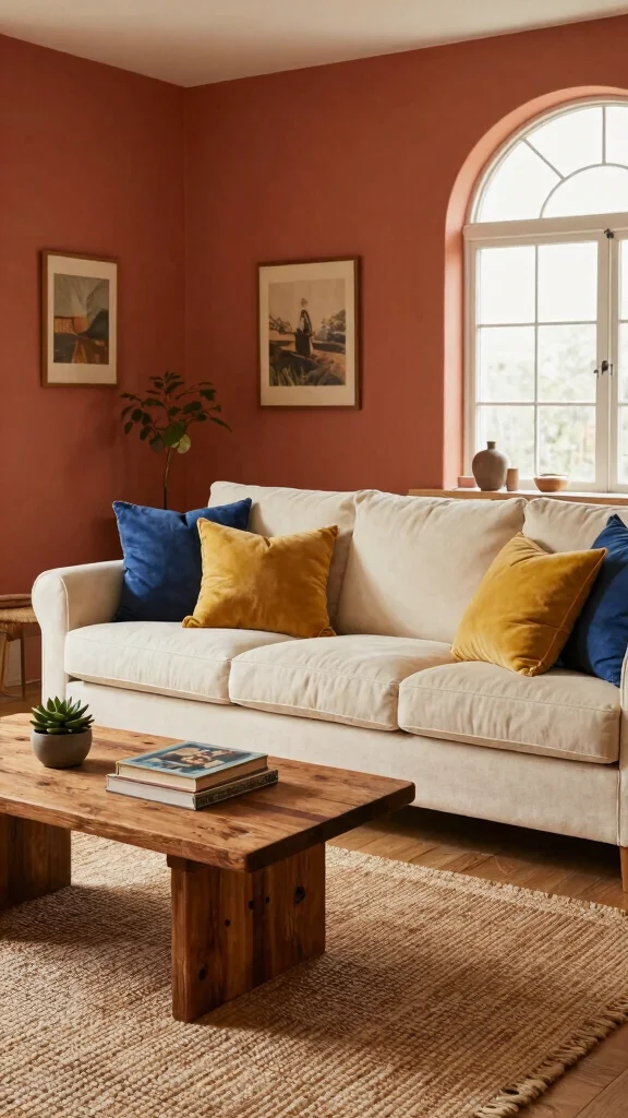
Warm Terracotta exudes a cozy charm that instantly transforms your living room into a welcoming haven. This earthy hue captures the essence of rustic Mediterranean style, creating an inviting atmosphere perfect for both gatherings and quiet moments. Its rich tones add depth and character, serving as an ideal backdrop for a variety of decor styles.
To effectively utilize Warm Terracotta, think about applying it as a primary wall color or in accent pieces. Pair it with neutral shades, and introduce splashes of vibrant colors like teal or mustard to create dynamic contrast, ensuring a lively and engaging space.
Consider these decorating ideas with Warm Terracotta:
– Incorporate natural fabrics like jute to enhance the earthy feel.
– Add art pieces in complementary colors for visual interest.
– Use vintage decor items to resonate with the hue’s warmth.
This approach creates an inviting atmosphere while celebrating the organic textures that enhance your living space.
Warm Terracotta
Editor’s Choice

SAFAVIEH Area Rug 6×9 – Natural Fiber Collection – Natural & Beige, Seag…

110” Oversized Cloud Sectional Boneless Couch for Living Room, Modern B…

Berlune 6 Pcs Velvet Throw Pillow Covers 18″ x 18″ Decorative Cushion Ca…
Recommended Products

【Large Abstract Beige Wall Art Set】This large abstract beige framed canvas wall art set features an abstract design that evokes neutral scenes or textures with soft neutral tones, gentle color and blurred edges. Ideal for the living room, bedroom, office, this artwork adds a touch of simplicity and elegance.

3 Color Temperature Bulb Included: Dimension of this floor lamp is 60" height, diameter and height of lampshade is 10.04" and 7.87", diameter of base is 8.66". Includes a 9W LED bulb which has 3 different color adjustable temperature setting: 3000K/5000K/4000K. You can easily change the color temperature to set the overall ambiance of the room

【Modern Neutral Wall Art for Living Room】This neutral abstract wall art set of 3 adds effortless elegance to your space. Designed as wall art for living room, it combines minimalist tones with beige wall decor and warm brown details, making it a stylish choice for bedrooms, offices, or entryways.
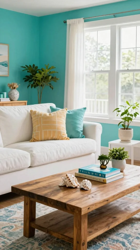
3. Sky Blue
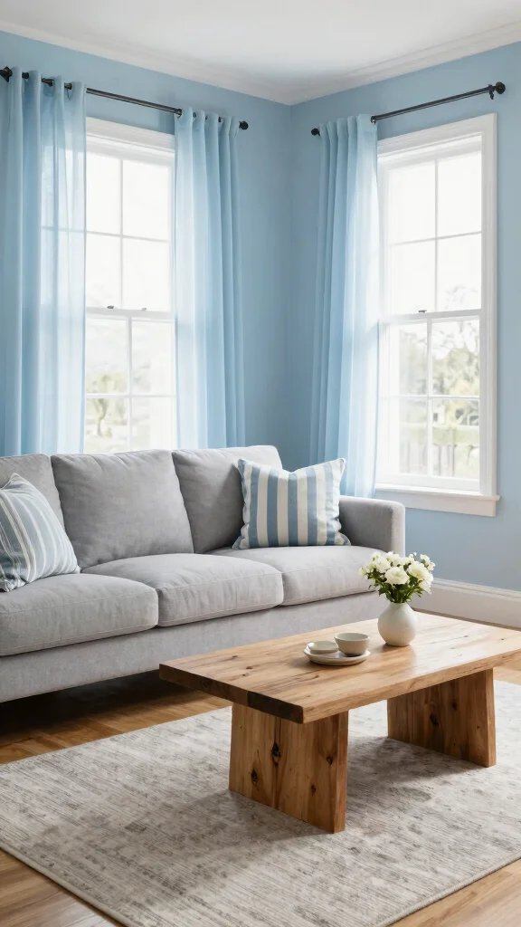
Sky Blue is a beloved color that brings a refreshing sense of serenity to your living room. This light, airy hue can visually expand a space, making it ideal for creating an open and inviting environment. Its tranquil tone reflects the beauty of nature, making it a great choice for eco-friendly homes.
To incorporate Sky Blue effectively, consider pairing it with soft whites or creams for a bright and airy feel. Using this shade on walls can create a soothing backdrop, while navy blue accents or light-colored wooden furniture can provide a stylish contrast.
Here are some tips for decorating with Sky Blue:
– Use varying shades of blue in cushions and art to add dimension.
– Incorporate natural elements like seashells for a coastal vibe.
– Consider sheer curtains in similar tones to let light filter in.
This color not only enhances the aesthetic but also contributes to a calming atmosphere through its gentle hues and natural influences.
Sky Blue
Editor’s Choice
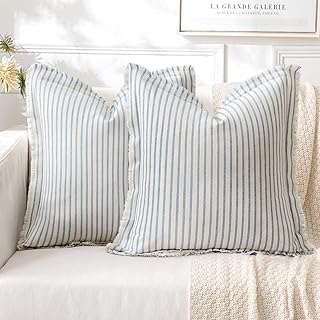
MIULEE Pack of 2 Light Blue Pillow Covers 18×18 Inch Striped Farmhouse C…
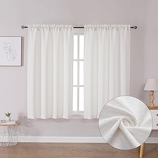
Lecloud Bessie Curtains 45 Inch Length 2 Panels Set, Light Filtering Fau…

All In One Paint, Wood Paint No Sanding for Furniture, Cabinets, Home De…
Recommended Products

CONVENIENT SIZE - This terra cotta acrylic paint set includes 6 - 2 oz bottles of textured paint. The colors in this paint set include: FolkArt Terra Cotta Snowbank, Adobe White, Bermuda Sand, Mesa Pink, Pueblo, and Clay Pot

BOHO BOTANICAL GEOMETRIC ART SET:This boho botanical geometric framed canvas wall art set features abstract plant figure designs in soft sage green and warm terracotta tones,blending delicate leaf silhouettes with geometric shapes to create a calm,modern minimalist aesthetic.

CONVENIENT SIZE - Each bottle of FolkArt Terra Cotta comes in a versatile 2 fl oz bottle - perfect for all your arts and crafts!
4. Pale Lavender
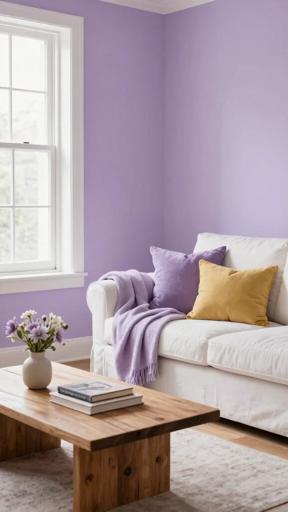
Pale Lavender adds a delicate touch to your living room, making it a popular choice for those seeking a serene and stylish retreat. This soft hue promotes feelings of tranquility and balance, ideal for creating a peaceful environment. It pairs effortlessly with both muted and vibrant colors, allowing you to craft a layered, visually appealing look.
Consider applying Pale Lavender to your walls to set a calming backdrop, while accenting with deeper purples or warm yellows for a harmonious balance. This color shines when combined with natural wooden tones, enhancing the organic feel of your space.
Decorating ideas for Pale Lavender:
– Incorporate soft textiles like velvet for a luxurious touch.
– Use lavender-scented candles to create an inviting ambiance.
– Add artwork featuring floral themes to complement the calming vibe.
This approach not only elevates the overall aesthetic but also infuses warmth through its rich textures and materials.
Fun fact: Pale lavender walls can boost perceived calm by up to 20% and reduce glare, a surprising perk for eco-friendly living room paint colors. Pair with warm accents to craft a serene, stylish retreat that still feels vibrant.
Pale Lavender
Editor’s Choice

Dusty Rose Pink Throw Pillow Covers 12×20 Inch Set of 2 – Christian Gi…

Acrylic Paint Brush Set, 1 Packs / 10 pcs Watercolor Brushes Painting Br…

Bedsure GentleSoft White Throw Blanket for Couch – Soft Cozy Fleece Thro…
Recommended Products

【Framed Abstract Colorful Wall Art】Three framed abstract boho 2D canvas prints featuring repeating arch and line motifs in soft beige, taupe and blush. Each wall art measures 24"Wx36"H. Printed image on a flat canvas; this is a 2D canvas print rather than a raised or carved artwork

EASY TO USE, EVEN FOR BEGINNERS: Whether you’re new to DIY or a pro, Rust-Oleum Chalked makes painting easy and enjoyable. Minimal prep required means you can jump right into your project confidently and focus on creativity—not complicated steps

[Premium Quality Materials] High definition modern artwork printed onto industrial grade framed canvas. Totally 3 panels, the size for each panel is 16"x24".
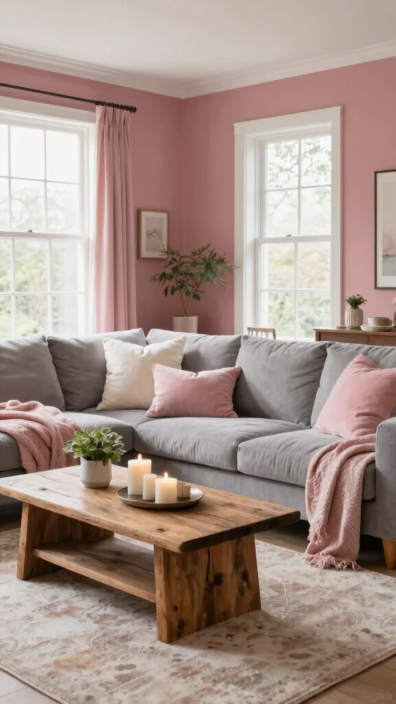
5. Muted Blush Pink
Muted Blush Pink introduces a chic warmth and sophistication to your living room, offering a cozy environment that is perfect for relaxation and entertaining alike. This soft, subdued pink creates a versatile palette that pairs beautifully with various colors and decor styles.
The psychological effects of pink, known for evoking love and warmth, make it a delightful choice for creating a soft ambiance. Muted Blush Pink works wonderfully with neutrals like beige and gray, providing a calming effect, while deeper greens or navy can create a striking contrast.
Ways to incorporate Muted Blush Pink:
– Use it as an accent wall behind your sofa for a focal point.
– Choose decorative elements in diverse textures for added depth.
– Add greenery through plants to enhance the blush tones and airiness.
This color choice not only elevates your living space’s aesthetic but also enriches it with warmth through its inviting textures and materials.
Muted Blush Pink
Editor’s Choice
Dusty Rose Pink Throw Pillow Covers 12×20 Inch Set of 2 – Christian Gi…
5×7 Washable Area Rug for Living Room & Bedroom, Large Light Pink Rugs f…

Yookeer 3 Pcs Floral Wooden Hanging Wall Art Inspirational Quotes You Ar…
Recommended Products

Self-Priming formula - requires no sanding

PROFESSIONALLY RECYCLED PAINTS: Lower cost alternative to virgin paint, without sacrificing quality. One quart of Recolor Chalk Finish, Grass covers about 100 square feet. This is chalk, latex paint with a very matte chalkboard finish. Can be used to turn any wall into a chalkboard and give an old piece of furniture a new life—produced in the USA!

6. Charcoal Grey with White Accents
Charcoal Grey is a striking color that brings depth and sophistication to your living room. This deep hue provides an elegant backdrop for lighter furnishings and decor, creating a beautiful contrast that enhances the overall design. Balancing the darker tones with lighter accents, like white or soft neutrals, ensures the space feels inviting and not overwhelming.
The stability associated with grey promotes a calming atmosphere while offering versatility in decor styles. Pairing charcoal grey with gold or brass accents can introduce a touch of glamour, while natural textures can provide a more organic feel.
For using Charcoal Grey effectively:
– Incorporate soft lighting to create an inviting atmosphere.
– Use a variety of textures, like plush sofas, to add warmth.
– Accent with colorful artwork to inject personality into the space.
This approach not only enhances the elegance of your living room but also enriches the ambiance with comforting textures and materials.
Charcoal Grey with White Accents
Editor’s Choice

8×10 Area Rugs Washable Rug: Large Modern Abstract Living Room Rug Soft …

KEIKI 103″ Boucle Half Moon Curved Sectional Sofa with 4 Throw Pillows, …

Multicolored Rainbow Abstract Throw Pillow Covers 18×18 in Set of 2, Dec…
Recommended Products

Floral Design: Neutral white, cream, pink, and orange blooms


【Mountain Forest Wall Art】 The OKUDOLIT framed mountain art set includes three stunning 16"x24" canvas prints. Featuring misty forest landscapes and tranquil mountain views in calming sage green tones, these large wall art pieces are perfect for bringing the serenity of nature indoors. Their size makes them great focal points, perfect for creating a tranquil and modern atmosphere in your home.
7. Earthy Umber
Earthy Umber connects your living room to nature, promoting a sense of comfort and grounding. This deep, rich color creates a warm and inviting space that resonates with organic materials, making it a favorite in eco-friendly design.
Using Earthy Umber can enhance the coziness of your space, especially when paired with softer tones or contrasting shades. Consider applying it as a feature wall or throughout the space, balancing it with light-colored furnishings to maintain an airy feel.
Ways to enhance your living room with Earthy Umber:
– Add natural wood accents for a cohesive organic look.
– Use layered lighting to brighten darker areas.
– Incorporate textiles like woven rugs to enhance the earthy vibe.
This approach not only brings warmth to your design but also enriches the space with natural textures and materials.
You might also like
Recommended Products
【Perfect Size for Versatile Display】Each 12"x16" canvas panel adapts to vertical or horizontal arrangements, effortlessly enhancing living rooms, bedrooms, or office spaces with customizable layout options
【Large Abstract Beige Wall Art Set】This large abstract beige framed canvas wall art set features an abstract design that evokes neutral scenes or textures with soft neutral tones, gentle color and blurred edges. Ideal for the living room, bedroom, office, this artwork adds a touch of simplicity and elegance.

Large Boho Wall Art: This neutral boho wall art set includes three matching framed canvas prints, each measuring 16 x 24 inches. Hang them together as a statement gallery wall or display separately to bring a cohesive look to different rooms
Earthy Umber
Editor’s Choice

Alaterre Furniture Durango 20-Inch Tall Industrial Wood Dining Stool – T…

LANANAS Neutral Couch Throw Pillow Covers 18×18 Inch Set of 4 Decorative…

8×10 Area Rugs for Living Room: Fluffy Shag Soft Washable Rug Large Fuzz…
Recommended Products

Neutral Linen Curtains: Crafted from a premium 20% linen and 80% polyester blend, these curtains combine rustic charm with primitive elegance. They feature superior thickness and softness for enhanced durability and comfort, while draping effortlessly with a naturally wrinkle-free finish.

CONVENIENT SIZE - This terra cotta acrylic paint set includes 5 - 2 oz bottles of textured paint. The colors in this paint set include: FolkArt Terra Cotta Snowbank, Terrazzo Tan, Mesa Pink, Pueblo, and Clay Pot
Package includes: Includes One Panel 50"W x 124"L with both a rod pocket and back loop for versatile hanging. Designed in Europe and made in India, it brings elegant charm to any room with minimal effort and for mothers day gifts for mom
8. Ocean Teal
Ocean Teal evokes a vibrant yet calming energy reminiscent of tranquil waters, making it a refreshing choice for your living room. This hue adds a touch of seaside charm and works beautifully with both light and dark furnishings, creating stunning contrasts in your decor.
The emotional balance and creativity associated with teal can inspire a relaxed and positive environment. When using Ocean Teal, consider pairing it with whites and sandy tans for a coastal feel or with deeper colors for a dramatic effect.
Decorating tips with Ocean Teal:
– Incorporate natural elements like driftwood for added texture.
– Use sheer fabrics to enhance the fresh feel of the color.
– Accent with metallics for a chic, modern touch.
This color not only uplifts your space but also enhances the overall ambiance with its refreshing tones and textures.
Ocean Teal
Editor’s Choice
Pro Grade Paint Brushes, 5-Piece Paint Brush Set: Flat & Angle Brushes f…

Tritard Nautical Coastal Throw Pillow Covers 18×18 Set of 2 Beach Themed…
Bates – Paint Tray Set, Paint Rollers, Paint Brushes for Wall, Tray, Rol…
Recommended Products

Foldable Pink Area Rug:This pink carpet can be used as a vibrant and fresh pink room decor to livingroom or bedroom.The 9x12 rug can be folded without leaving creases for easy storage.Ultra soft,low-pile,absorbent and long-lasting,this large rug can be used in heavy traffic areas of your home without blocking the door opening.

CONVENIENT SIZE - This Apple Barrel Gloss Acrylic Paint comes in a versatile 2 oz size that is great for basecoating, stenciling and so much more

🌼 BLOSSOMING PASTEL MEADOW: Experience the beauty of a wildflower wall art scene, a dreamy impressionistic oil painting of a field in bloom with soft pastel flowers creating a romantic and calm mood.
9. Creamy Vanilla
Creamy Vanilla is a classic and versatile choice that infuses a light and airy feel into your living room. This soft, warm hue serves as a perfect canvas, allowing other colors and textures to shine and making it particularly beneficial in smaller spaces.
Creamy Vanilla evokes warmth and comfort, creating a welcoming environment. Its versatility suits various decor styles, whether farmhouse or modern, and it pairs beautifully with bolder colors or rich textures for added visual interest.
For incorporating Creamy Vanilla:
– Use it on walls and ceilings for a cohesive look.
– Layer with plush textures for added dimension.
– Add colorful accessories to create focal points and inject personality.
This choice not only enhances the aesthetic but also enriches the space with warmth through its inviting textures and materials.
Creamy Vanilla
Editor’s Choice

Phantoscope Pack of 2 Corduroy Soft Pillow Covers Decorative Striped Vel…

12 Set Paint and Sip Kit for Adults 8″x 10″ Pre Drawn Canvas for Paintin…
8×10 Area Rugs Washable Rug: Large Modern Abstract Living Room Rug Soft …
Recommended Products

PAINT + PRIMER IN ONE: Evolve’s paint-and-primer formula helps you get great coverage from the start, sealing your surface and reducing the extra work of multiple coats.

PAINT + PRIMER IN ONE: Signature formula delivers flawless coverage from the first stroke, sealing surfaces and minimizing coats for a refined finish.

PROFESSIONALLY RECYCLED PAINTS: Lower cost alternative to virgin paint, without sacrificing quality. One gallon of Recolor Interior Finish, Storm covers about 450 square feet. This is interior, latex paint with a finish that is between flat and eggshell—produced in the USA!
10. Deep Hunter Green
Deep Hunter Green introduces richness and sophistication to your living room, evoking a strong connection to nature. This deep, earthy hue creates a dramatic atmosphere when paired with lighter colors and natural woods, adding depth and character to your space.
Associated with growth and renewal, this color provides a comforting effect that contributes to a serene environment. When using Deep Hunter Green, consider applying it to a feature wall or as an accent in furniture and decor. Gold or brass accents can beautifully complement this hue for a luxurious touch.
Ideas for using Deep Hunter Green:
– Combine with warm wood tones to enhance its earthy vibe.
– Pair with soft whites for a balanced atmosphere.
– Utilize plants in similar tones for a cohesive and refreshing environment.
This approach not only enhances the overall aesthetic but also enriches the space with natural textures and materials.
Deep Hunter Green
Editor’s Choice

4 Rolls Premium Painters Tape, Blue Tape, Masking Tape, Paint Tape for M…
Pro Grade Paint Brushes, 5-Piece Paint Brush Set: Flat & Angle Brushes f…
Bates – Paint Tray Set, Paint Rollers, Paint Brushes for Wall, Tray, Rol…
11. Soft Creamy Beige
Soft Creamy Beige creates a warm and inviting atmosphere in your living room, making it a beloved choice among homeowners. This versatile color serves as a perfect backdrop for various decor styles, allowing for easy pairing with an array of hues.
Utilizing Soft Creamy Beige can enhance natural light, making your space feel brighter and more spacious. This calming shade promotes relaxation, making it ideal for unwinding after a long day. Pair it with rich colors and textures to add depth or keep it light for a fresh feel.
Decorating tips with Soft Creamy Beige:
– Use it on walls and larger furniture pieces for a cohesive look.
– Incorporate warm-toned decor to accentuate the inviting vibe.
– Layer soft textiles in various shades for a cozy, finished look.
This choice not only enhances visual appeal but also enriches the overall ambiance with its warm textures and materials.
Fun fact: Soft Creamy Beige can boost perceived space by as much as 15–20% by reflecting natural light. It pairs effortlessly with eco-friendly living room paint colors, creating a warm, calming backdrop for any decor style.
Soft Creamy Beige
Editor’s Choice

Solid Wood Coffee Table – 42.5” Firwood Farmhouse Rustic Wooden Coffee…
Ophanie 6×9 Area Rugs, Upgrade Non-Slip Fluffy Soft Rugs for Living Room…

decorUhome Cozy Textured Throw Pillow Covers 18×18 Inch Set of 2, Soft P…
12. Bright Mustard Yellow
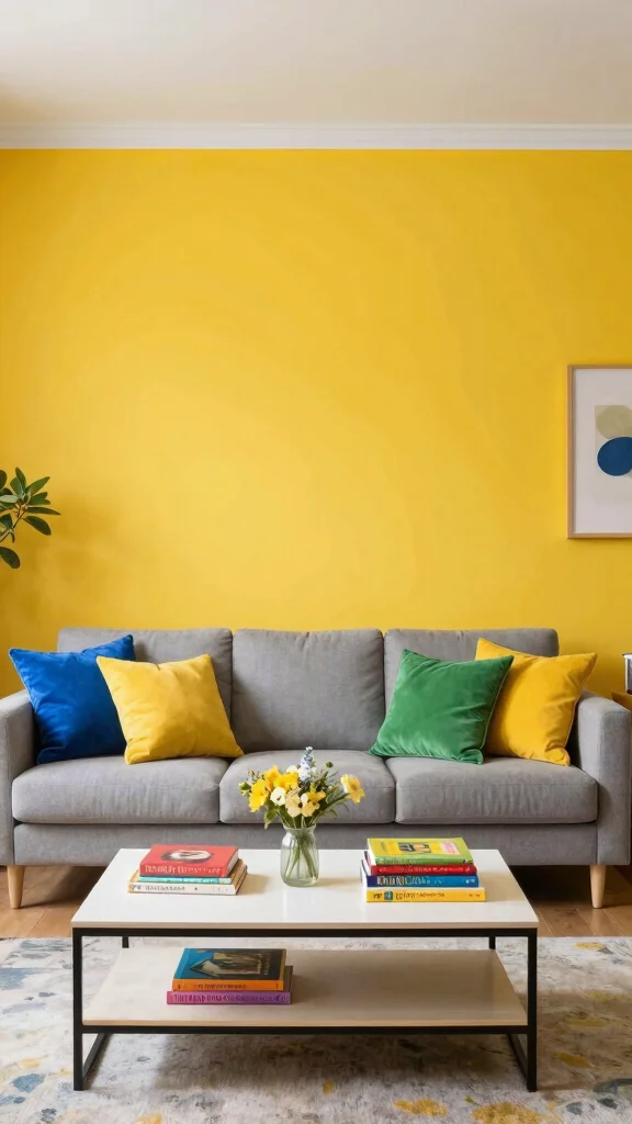
Bright Mustard Yellow infuses your living room with a cheerful and energetic vibe, making it an ideal choice for those looking to add personality to their space. This vibrant color creates an uplifting atmosphere perfect for lively conversations and gatherings. When balanced with neutral tones, it adds a sophisticated edge to your decor.
Associated with happiness and creativity, mustard yellow is fantastic for inspiring joy in your environment. Use it as an accent wall or in decorative elements to make a bold statement, pairing it with deep blues or soft grays for a chic contrast.
Ways to incorporate Bright Mustard Yellow:
– Use it in throw pillows for a pop of color.
– Consider patterned textiles that feature mustard highlights for cohesion.
– Combine with natural elements to balance brightness with warmth.
This choice not only elevates the aesthetic but also enriches the space with vibrant textures and materials.
Bright Mustard Yellow
Editor’s Choice

Paint Brushes Set of 24 Pieces Wooden Handles Brushes with Canvas Brush …

Bright Colorful Wall Art Abstract Wall Decor for Living Room Aesthetic R…

Utopia Bedding Throw Pillows (Set of 4, White) – 18 x 18 Inches Down A…
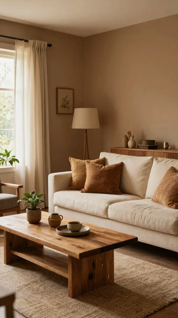
13. Warm Taupe
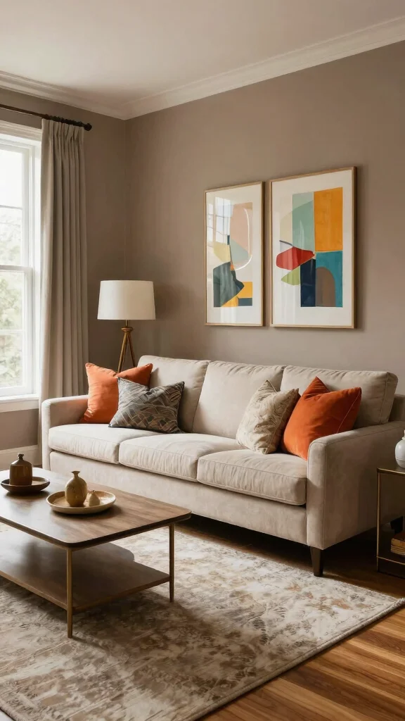
Warm Taupe is a sophisticated color that adds warmth and versatility to your living room. This neutral shade strikes a balance of gray and brown, serving as a perfect base color that pairs well with various other hues. It creates a cozy atmosphere while maintaining a modern touch.
Using Warm Taupe on your walls offers a fantastic backdrop for bolder colors and textures, promoting a sense of calm and comfort. Consider pairing it with jewel tones, metallics, or soft pastels for an elegant look.
For incorporating Warm Taupe:
– Use layered lighting to highlight the rich undertones.
– Accessorize with contrasting colors for visual interest.
– Combine with natural wood furniture for an organic feel.
This approach not only enhances your living room’s elegance but also enriches the space with comforting textures and materials.
Warm Taupe brings cozy sophistication to living room paint colors without shouting. It’s the practical base that lets jewel tones shine while keeping your space calm and eco-friendly.
Warm Taupe
Editor’s Choice

The Color Wheel Company Interior Design Wheel interior design color whee…

VOOMEY Paint Edger Tool Kit, 9 Inch Paint Pad Set, 7 PCS Paint Edger wit…

Pro Grade Paint Roller Kit, Brush & Roller,10 Piece Set, Wall Painting N…
14. Dusty Rose
Dusty Rose introduces a soft yet vibrant touch to your living room, adding a hint of romance and warmth. This muted pink shade offers depth, creating an inviting atmosphere that feels both stylish and cozy. Dusty Rose pairs beautifully with neutral tones, allowing for a well-rounded palette that enhances the overall aesthetic of the room.
Known for promoting feelings of love and comfort, this color is perfect for spaces where you unwind and relax. Consider using Dusty Rose on all walls or as an accent through textiles and decor. It looks stunning when paired with gold or brass accents for a touch of glam.
Decorating ideas for Dusty Rose:
– Choose throws and cushions in varying shades for a layered effect.
– Incorporate natural materials like wood to balance softness.
– Use mirrors or reflective surfaces to enhance light in the space.
This choice not only elevates the room’s aesthetic but also enriches it with warmth through inviting textures and materials.
Dusty Rose
Editor’s Choice
Dusty Rose Pink Throw Pillow Covers 12×20 Inch Set of 2 – Christian Gi…

Bedsure GentleSoft Pink Throw Blankets for Women – Super Soft Cozy Fleec…
5×7 Washable Area Rug for Living Room & Bedroom, Large Light Pink Rugs f…
15. Light Steel Blue
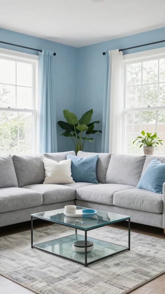
Light Steel Blue is a soft, cool hue that brings serenity to your living room, creating a refreshing and tranquil atmosphere. This delicate shade pairs well with a range of colors, especially whites and soft grays, allowing for a sophisticated yet calming palette.
The calming effects associated with blue can enhance the overall mood of your space, making it perfect for those seeking relaxation. Consider using Light Steel Blue on walls or as an accent color through decor items for a balanced look.
Ways to bring Light Steel Blue into your design:
– Pair with natural elements like wood to enhance the peaceful vibe.
– Incorporate soft textures and layered materials for added depth.
– Use artwork that features similar hues to create a cohesive theme.
This approach not only enriches your living space but also enhances its overall aesthetic through peaceful textures and materials.
Light Steel Blue
Editor’s Choice

Rainbow Classroom Rug 3’x5′ Washable Boho Calming Corner Rug for Girls B…

Pajean Calm Down Corner Bulletin Board Set for Classroom Decoration Feel…
Conclusion
Selecting the right living room paint colors can significantly transform your space, adding warmth, personality, and comfort. Whether you prefer soft greens, rich blues, or warm neutrals, each color exudes a unique vibe that can enhance your living environment.
As you embark on your living room makeover journey, consider the psychological impacts of these colors and how they align with your personal style. Remember to play with textures and accents to create an inviting atmosphere that truly feels like home.
Note: We aim to provide accurate product links, but some may occasionally expire or become unavailable. If this happens, please search directly on Amazon for the product or a suitable alternative.
This post contains Amazon affiliate links, meaning we may earn a small commission if you purchase through our links, at no extra cost to you.
Frequently Asked Questions
How can I pick eco-friendly living room paint colors that stay on-trend?
Choosing eco-friendly living room paint colors that stay on-trend is easier when you blend sustainability with smart design.
Start with low-VOC and zero-VOC options and reference the latest interior design trends. For a calm base, pick neutral paint color palettes like warm beiges or cool greys, then add personality with a sustainable accent color.
Consider color psychology to set the mood—calm for a family lounge or energizing for a social area. Test large swatches on walls, check how the hue changes with daylight, and keep the rest of your décor eco-friendly with furniture and textiles. If you are unsure, consult with a pro about eco-friendly paints that cover well and resist fading.
What role does color psychology play in choosing living room paint colors?
Color psychology helps you set the mood and energy of a space.
Warm earthy tones invite coziness and conversation; cool greens and blues promote calm and focus; crisp neutrals feel versatile for home decoration ideas.
When planning a living room makeover, pick a paint color palette that aligns with the vibe you want, and use an eco-friendly accent to keep things fresh. Observe how the hue shifts with lighting and ensure the base supports interior design trends while staying comfortable to live in.
How can I create a cohesive paint color palette for a living room makeover while keeping it eco-friendly?
Start with a sustainable base: a light neutral for walls, then bring in color with eco-friendly accents such as textiles, artwork, or reclaimed wood.
Build around 2-3 main hues and 1 accent that connect to adjoining rooms.
Verify paints use low-VOC and are water-based. Create a mood board of your paint color palettes, test on large panels, and check daylight influence. Finish with the right sheen (eggshell or satin) for durability and easy cleaning in daily living.
Are there practical tips to test eco-friendly paint colors before committing?
Yes. Order sample pots of your top hues and paint large test patches on the actual wall to see how they look with your furniture and lighting. Do this at different times of day to catch changes in natural light. Compare the vibe with your overall home decoration ideas and see if the undertones work with existing wood tones, metals, and textiles. Choose finishes like eggshell or satin for durability and easier cleaning. And always confirm low-VOC certifications on your chosen paints.
What are common mistakes to avoid when selecting living room paint colors for a makeover?
Common mistakes include ignoring Undertones, choosing color first without considering lighting, picking too-dark hues for small spaces, not testing with large swatches, and neglecting eco-friendly properties like low-VOC and water-based formulas. To fix: start with a light base, test with your actual furniture, ensure your sheen matches daily use, and pick a palette that supports interior design trends while remaining practical for daily living. Also avoid mixing too many colors—limit to 2-3 main hues and 1 accent to keep the look cohesive for a true living room makeover.
Related Topics
living room paint colors
eco-friendly decor
interior design trends
color psychology
paint color palettes
living room makeover
sustainable living
modern design
home decoration ideas
beginner friendly
quick updates
trending colors